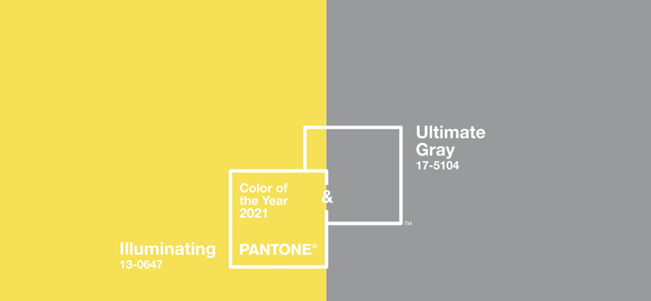
It’s been quite a year… from a historic pandemic with lockdowns, quarantines, and devastating losses, to riots, looting and general chaos. After everything we have been through in 2020, we need something bright and cheery to look forward to! It makes perfect sense that Pantone has chosen the cheerful and vibrant Illuminating (13-0647) along with the enduring shade of Ultimate Gray (17-5104) to be the Colors of the Year for 2021!!
 Photo by Brandi Ibrao on Unsplash
Who is Pantone?
The Pantone Color Institute highlights the top seasonal (fashion) runway colors, selects the Pantone Color of the Year and forecasts global color trends. These trends are then reflected in fashion, home furnishings, beauty and accessories. To learn more about Pantone, please check out their website at www.pantone.com/about-pantone.
The Pantone 2021 Colors of the Year
On Dec. 9, Pantone announced that its 2021 Colors of the Year are Ultimate Gray and Illuminating, shades chosen for their warmth and dependability.
To determine the Color of the Year, Pantone looks for color influences in entertainment and film, art, fashion, all areas of design and travel destinations. They also look at lifestyles and socio-economic conditions. Their decision may be influenced by new technology, materials and textures that impact color.
You’ll see these colors reflected in everything from paint colors and home furnishings to fashion, packaging and graphic design.
Pantone describes the 2021 Colors of the Year as “Practical and rock solid but at the same time warming and optimistic”, “strength and positivity”, “feelings of thoughtfulness with the promise of something sunny and friendly.”
 Photo by Max Böhme on Unsplash
“The selection of two independent colors highlight how different elements come together to express a message of strength and hopefulness that is both enduring and uplifting, conveying the idea that it’s not about one color or one person, it’s about more than one. The union of an enduring Ultimate Gray with the vibrant yellow Illuminating expresses a message of positivity supported by fortitude,” Leatrice Eiseman, executive director of the Pantone Color Institute, said in a news release.


What do these colors mean to us?
Paparazzi prides itself on being current and on trend. They use the seasonal Pantone colors in the design of the accessories we will see in the upcoming spring and summer lines. Pantone provides a universal language of color that allows Paparazzi to create accessories that will pair perfectly with the new spring and summer fashions. Look for Paparazzi’s spring line to include a variety of ways to add Illuminatingand Ultimate Gray to your wardrobe along with other colors from the Pantone Spring/Summer palette that will compliment these colors.
How to add the Colors of the Year to your wardrobe
If you love color, this spring is for YOU! You can wear bright bold colors and pair them with accessories that add color or contrast; or tone them down a bit.
One of the best things about yellow is that it goes great with almost any other color. Pair it with a dark neutral and a splash of white for a balanced look. Bright yellow can be overwhelming in large doses, but you can still be on trend by adding a bold yellow necklace to a more neutral outfit. Try our Gorgeously Globetrotter Yellow Necklace, for example.
The combination of gray and yellow, pairing bold and neutral, opens a world of opportunities. While they go very well together (like our Seaside Soiree Necklace, above), and we’ll see lots of examples of the two together, you don’t have to wear both. Use yellow to add a pop of color to neutral outfits.
Accent bold outfits with neutral (gray) accessories to tone them down.
(Wanna Piece of MACRAME Silver Earrings)
Bold or demure, you’ll be able to express yourself as you see fit.
Will you be adding Ultimate Gray or Illuminating to YOUR spring wardrobe? Let me know in the comments below how or if you plan to use these colors.






Leave a comment (all fields required)